
So I had my picture, but now how to do it. I could do a pencil illustration, or charcoal (because that worked so well last time right?), or pen and ink, but this one needed to be painted as it was partly the colour that drew me to it. Not a speed paint either (though still in ArtRage), something a little more challenging. You can see the results, and my challenges, after you click more (assuming you're not already reading the expanded post).

You can see a somewhat larger version by clicking on it as usual.
So what were the particular challenges to this one? Well, first of all I decided I was getting far to comfortable using pretty much just the oil paint tool. Yes, I have tried the watercolor tool here and there, and the pencil tool, and the roller (If you know nothing of digital painting or this otherwise means nothing to you that's OK). Anyway, I decided to paint this using the roller minimally, and the pencil, watercolor and oil paint tools not at all. This forced me to try new techniques.
The second challenge was that I decided to do it all on one layer. I failed at this, but only just. The initial sketch is on one layer (think of it as a projection), and the snow that's fallen on him is on a third layer. Mostly this is because the technique I was using for that has a fair amount of randomness to it and I wanted to be able to easily erase wayward spots.
Oh, and I didn't sample any colours from the photograph - I had to pick them by eye. I think I did a pretty reasonable job of that this time.
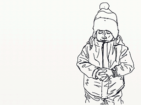
So we'll get through the rest of this quickly because I want to go to bed tonight. First of all, here's the photo that inspired it, and the sketch that the resulting image came from.

If you're paying attention you'll see some differences, such as his hands being to big in the sketch, there being less perspective, and his head being at a different angle (he's also missing a finger). I could have fixed those issues, but at the time I thought the match was good enough to start painting (in retrospect I wish I'd spent a little longer on it, ah well).
So I did start painting, and here we have a nice animated gif of the process.
I was going to capture the process to create a timelapse video, but I'm glad I didn't as this was done over several sessions and took quite a while. I don't know exactly how long, but at least 5 hours, so a video of it would take a while even when sped up. So you get the multiple saves I did for the purpose condensed into a gif.
I started off painting using art markers to paint his face and coat, and that is predominantly the tool used for those all the way through, as well as for his hands. For his hat though it was going to be difficult to get the woolly effect that I wanted using the markers, so I laid down the base colours with the art markers and then switched to using chalk and crayon for the pattern. This had the advantage of picking up the grain of the canvas, which looked enough like knit to suit my purposes. I still had to paint the stitches of the pattern individually, but it still saved a lot of time. I used a similar technique on his bobble, and then smeared it with the palette knife to get the furry result.
The initial snow pass on his hat was done with the spatter sticker brush I had previously created for this image back in September, and that I also used when painting this picture of The Doctor. Nice to have made more use of it since it took a while to create. Other snow layers were built up with the chalk tool and a new variation of the spatter brush that's a lot finer.
Finally I went over the whole image with the airbrush tool, just to add a little more definition to his face, add some light bleed around the edges, tidy up some blending issues on his coat and paint the background. This made a lot of difference to the finished image, even though I only spent a short while on the pass.
Now, I've had quite a few compliments on this one already, more than I would usually get, and I have a few theories about that. I'm not sure that it's appreciably better than much of my other stuff, but it doesn't involve guns, swords, shields, vampires, zombies, dinosaurs, scantily clad women or grimacing men. It's just a little boy looking sad in the snow, and I think people respond to that who usually wouldn't even click on the thumbnail. "Awww, poor dab, how sweet," they think, "I like this!" they say, because they had an emotional connection they otherwise wouldn't get. Food for thought there... Or possibly just food for the mouth in the top of my hat that doesn't know when to stay shut.


Well done good sir. I wish I had but a fraction of your talent.
ReplyDeleteawww, poor dab, how sweet! I really like this painting :)
ReplyDeleteMy fav by far. Love it ,Love it LOVE IT
ReplyDeleteGosh, Sam looks cold.
ReplyDeleteJoin us for lunch on the terrace
Love Bampa and Babs