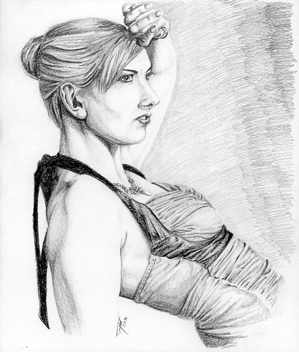
Uuuuuuuh, yeah. So it's beter than May's attempt (and this time I did the whole of the image, rather than just the crop), but it's not all that great really. If anything I learned from May's mistakes and then overcompensated. Oh, I didn't reference May's work before starting this by the way, seemed like that would be defeating the purpose of the exercise to me. So, much like I did in May I shall now pick the image apart. Imagine me looking depressed while I do this.
In Red is the original image, in Green is the sketch in negative to make comparison easier. Right away we can see that both arms are kinda off the mark, and her chest doesn't look particularly close. Oddly her neck and jaw are almost exactly on the money, as is her right eye and her mouth (at least the positions). Her head (and thus the hair) is too low down, her nose is too large (but only slightly) and her brow and chin jut out too far to the right of the image. Her back is fairly close to the mark, but her stomach is not (Makes her look slimmer though, I doubt many women would complain about this). Worse of all (arguably; the low head is pretty bad too) is the ear, which is the size of a small aircraft carrier. Not terribly flattering.
Time to compare this one to the last (and the original). For this I'll be losing much of the picture and returning to a crop as I used back in May.
So we can immediately see that this month's effort (to the right) is better than the one back in May; even through the red lines; but is still shockingly off the mark. I suppose you might be able to guess who it was of if you knew Naphania already, but I can only assume that; you certainly couldn't before though. I'm not going to walk through all of this, since you can see for yourself, but I will walk through what each of the lines is a measure of so you can see what improved since May, and what got worse. Click the image for a larger look.
- Top of the head
- Top of eye/bottom of brow
- Top of ear
- Bottom of Nose
- Top Lip/Base of Ear
- Bottom Lip/Top of Chin
- Bottom of Chin/Jaw


No comments:
Post a Comment