 Note: This post has almost nothing to do with Europe. Bonus points if you can spot why it's called that.
Here we are again, with another Philip Sandifer cover*. I can't claim to have done the artwork on this one (for a change), rather I did the design, but the actual art was by Mr. William Blake, a gentleman who's been dead for just shy of 200 years. Pretty sure the copyright on it has expired then, (fortunately, because I didn't pay for it).
This cover is for Neoreaction A Basilisk: Essays On and Around the Alt Right, which as you may have surmised, is not a book about Doctor Who. This one is a standalone, and presumably features some strong words and takedowns of the Alt-Right. I don't know for sure, as I haven't read it yet, but I think it's a safe bet. If you're interested in checking it out, you can find links to various ways to purchase it on his launch post, over here.
*If you're new to the blog, or the cover series, you can read the entries on the previous ones by clicking here.

So that's the cover above, which looks a little messy. hopefully it looks interestingly messy though, as I spent a while on doing it. The original idea for this design comes from the cover to the title essay of the book, which was previously released as a booklet by Dr. Sandifer, and for which he did his own cover.
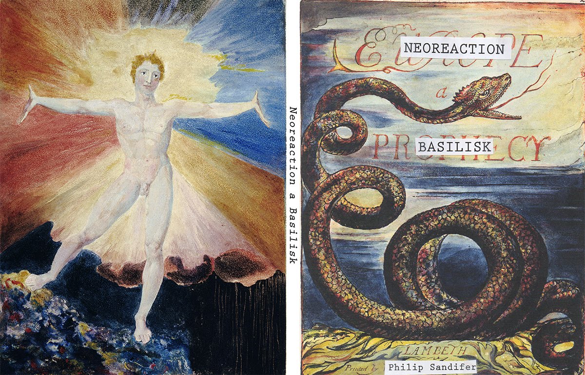
This is Phil's cover for that release of the essay, and as you can see it's the cover to Europe a Prophecy by William Blake with Phil's name and title pasted roughly over the top to obscure the title. I poked at doing something different, but eventually worked around to 'Well, it worked for the Essay, maybe it'll work for the book too?' But fancier, because it's an actual book.

The rough I came up with following that revelation was this. I liked the idea of the leather bound Blake book being used to contain something Other. You may note some differences between this version and the final. Part of that is because this mockup was done entirely in Photoshop, with a Photo of some leather and some stock images of tape I found online. The other reasons were just that I tweaked the design slightly as I went along.
Once we decided on this cover, I couldn't find a suitably crisp image of leather online that I didn't need to pay for (and I really didn't want to pay for one). I also wasn't happy with how the gold looked, so it was time to think of another solution.

As it goes, I recently bought a piece of software called Substance Designer. It's primarily designed to create textures for video games (and probably movies), which is pertinent to my day job. One reason I've been doing less painting lately is I've been learning how to use it - not that I get to use it in the day job right now, but there may be a time when I need to, so I think I should know how to use it when I do.
Anyway, Substance Designer is specifically designed for creating physically based procedural materials, so I wondered if it was possible to do the leather material in it. Furthermore, could I do the gold design imprinted in the leather too. As you can see above, the answer to that question was yes.
The biggest difficulty was getting a black and white image of Blake's Basilisk in a high enough resolution. I'd found one for the mockup, but that was pretty small. In the end I found one at a quarter the resolution of the cover, but I thought that perhaps the embossing would hide some of the blockiness that would result from making it larger. After quite a bit of cleanup it seemed to work well enough, so I called it good.
There's more about the use of Substance Designer below, but having established I could use it, let's get back to Photoshop.

While I was reasonable certain I could use Substance to do the masking tape to a convincing degree of accuracy, I thought it would be a lot faster to just write on some masking tape and photograph it, which is what I've done here. I stuck the tape to a sealed canvas I had lying around, which was a bit silly in retrospect since the white of the canvas was quite close to the cream of the tape, making it trickier to cut out than if I'd just used black card. Ah well, live and learn.
The only other thing of note was trying to match the approximate lighting of the rest of the cover - I decided I'd light it from the centre of the spine, so that was fairly easy to match. Unfortunately I didn't do two versions, so the version actually on the spine is wrong. It's not terribly easy to spot though, so I went with it as is.

Here's the version of the cover with the tape in place. There's a little transparency to it, so if you look really closely you can see the original text behind it, as I expect you would with real tape.

Next I created the red label tape with Phil's name on it, made some tweaks to the cover design and threw the Blurb onto the paper stuck to the rear cover. Some of that I'll cover in more detail in the super nerdy bit at the bottom, but enough to say for now that the label tape was done in Substance Designer, directly on top of the Blake cover, while the paper and blurb were added in Photoshop - the paper being from a scan I did of a picture my Son drew some time ago. Obviously the picture isn't there, because I erased it. Oh, and the clear tape holding the paper is also from Substance, but output separately and compositied in Photoshop.
Phil wasn't happy with the layout of the Blurb, so he rewrote it to what you can see in the final at the top of the post, and he also wasn't happy with the way his name looked on the spine (Rightly so, it's crap). I corrected it in Substance, added it back into Photoshop and that was more or less that.
OK, time for the nerdy bit about Substance Designer - feel free to skip this bit if you like; the stuff above is most of the creative process, what follows is from a more technical view.

So this is a Substance Designer graph, specifically the one for the cover. Each of the little boxes, called a node, does something; like create a pattern, or a shape, or import an image, or merge together the output of two previous nodes, or something else entirely. The lines push the result of one node into the next node along the chain.
The ones in the large blue Output box push the results of all the nodes to a renderable material on a 3D object - In the case of the cover it's a flat square that's receiving the material. There are different outputs for different things in the material such as the Diffuse (the colour), the roughness (how smooth it is, or isn't), and the height.
Since the object I'd be rendering the material on is a square, it made sense to have the inputs also be square - this used to be a requirement of the software, since game textures are always either square, or a power of 2 (like a 2048x1024, or 64x512), but I think that's changed recently. Doesn't matter anyway, I was working in squares.

Anyway, the mask represents which bits of the cover are gold and embossed, and which bits are just leather.

Pushing the mask through the graph results in images like those above. The one on the left is the Diffuse (the colour of the material), while the one on the right is the Height - how far the materials appear to stick out from the surface). There are other textures output with them, which I'm not going to explain in depth here, such as the surface Normal Map (don't ask), the Metalness Mask (where the metal bits are), Specular Occlusion (also don't ask), and the aforementioned Roughness. If I've said not to ask it's because explaining would take a while, and is outside the scope of this post.

OK, so here's a closeup on the final 'Leather' part of the graph. This basically takes a bunch of patterns and noise and mixes them together to make the surface look like leather. Not quite as complicated looking as the whole graph right? It's only 24 nodes to make the leather. And that's how the graph is broken down - relatively simple structures like this blended together.

Originally there were even fewer nodes used to make the leather, and it looked OK, but more like cheap plastic faux-leather than actual leather. That's the upper left square in this image. The final leather, from that graph above, is the lower left square. Still not quite photographic quality, but close enough for the purposes of the cover. On the right of the image is how the finished leather looks with other elements such as the spine added, viewed from an angle with the light catching it. Fairly convincing... I hope.

Same deal, but this time for the red label sticker at the bottom. Originally I was just going to make actual labels, and scan them (much as I did for the Masking Tape), but it turns out the type of label makers to create these are not as easy to come by as they used to be, so I just threw them into the graph.

The left side of the graph basically makes the rectangles for the label, and creates a mask for the text like that above.

Then the rest of it takes that information, and creates the colour and height composites for the label, before blending it with the leather I already showed (the colour Diffuse is shown in this image - note how simple it is). It also splits a copy of the label in two, and then rotates and scales the copy to fit on the spine. Easy-peasy.

And here's how that turns out on the cover when seen in 3D. I think it looks pretty close to the real thing, and it has the advantage that the label will be lit along with the rest of the cover.
OK, that concludes the nerdy part of the post - hopefully it didn't bore you too much (if it did, why didn't you skip it?). This bring the total number of covers I've done for Dr. Sandifer to 11. That's quite a number - I'm going to need a larger book case for them (especially given the width of Last War in Albion Volume 1 - that thing is enormous)! It also means I've done almost as many covers for non TARDIS Eruditorum books as for it. I think that will change shortly though - I suspect then next TARDIS book will be along before the next Last War, but only Phil knows for sure.


No comments:
Post a Comment