
All up to date? Good, let's go look at the "new" stuff.

There she is, looking all aloof and dangerous. Down below you'll see her partner in crime, the Male Hunter (who also graces the thumbnail), but you know what they say; 'the female of the species is deadlier than the male**' So we should get the most dangerous one out of the way first. In the game both the female and male hunters are actually as deadly as each other - identical in fact. They reside on opposite sides of the same card, for which these images are for. There can only be one Hunter, but the player can choose if the Hunter is male or female by flipping the card. Pretty neat. So I didn't really paint her first because she was the deadliest - rather I did her first because she was the scariest. Artistically speaking.
You see, I already knew what the male hunter looked like, having painted him once already, and I'd already more or less figured out what I wanted his pose to be (and found an excellent reference), so in theory he was going to be easy. The female one though, I had no clue. Was she young, old, ugly, pretty, fat, thin? No clue! (I'm just going to call her the Huntress from now on by the way, it's easier, though the game does not differentiate beyond the picture). So I needed to come up with a look for her. I didn't want her to be the traditional seductive busty pin-up of the pulp era, but I also wanted to at least give a nod to that. I did know I wanted her seated - lording it up over the viewer in a superior manner, so that was something to go on anyway. I also decided, eventually, that she should be somewhat femme fatale, and of indeterminate age.

Firstly I needed some reference. I could have got someone to model for me perhaps, but I felt it couldn't be all that hard to find a good picture of a woman sitting down I could mangle to get what I wanted. I actually found one very quickly, with this image from Faestock on Deviantart. You may note that the pose is about 80% there already in the image on the right, and the arm of the left image looks suspiciously like the one the huntress ended up with. I grabbed a bunch of other reference too, for clothing and the like, but that was pretty much it for the pose.
The very rough proportions (not shown here, but top of the head to the bottom of the foot, where the head should go, that sort of thing) I traced to save time. I then used a grid to fill the details in, but made several small changes as I went. Why grid when I already traced - well, the tracing, rough as it was, mostly just aided me in not having to count grid squares to figure out where the side of her face might fall, that sort of thing. Obviously the grid wasn't going to help much with clothing and such, so those I had to figure out as I went along. The outfit is reasonably authentic for a woman in a 'masculine' role during the 1920s through to the '40s, and the shirt and black tie give her a slightly facist air I think. Tyler was a little concerned (rightly) that her ears being pushed out by the helmet, and the upturned nose made her look like a pig. I assured him I was just worried about proportion and the locations of the features at this point, and she wouldn't look like a pig when she was finished. I traced the gun directly from an image I found online, and then made some small alterations so the perspective matched a little better.
The central image is of the initial underlayer, and you can see it's pretty simple stuff. Unusually though I was working with a predetermined palette I'd worked out to keep everything harmonious. Amazingly, with one small exception, this did not bite me on the behind later, and I think it worked out pretty well.
The first pass on the trousers and shirt went pretty smoothly. another thing I'd decided in order to give it a feel that fit with the early 20th century was to try and evoke a little J.C. Leyendecker. Not try and copy his extremely distinctive style (that would be a pointless task - I'm not up to that challenge), but just make nods to it. The obvious hatching of the colour in parts (especially on the trousers) is part of this - though Leyendecker does this very differently, it's enough to evoke the era I think (there's a more obvious homage to his work a little later on). This style was quite new to me, but put me in mind of something falling somewhere between the hatched inkwork and 8-bit style pixel art I've done in the past.

Not a lot extra to add for these steps, although I did reach the conclusion in the second image that I should leave at least some of the lines from the original sketch visible in the final to add a little definition to some areas. It just looked slightly better with them than without. I was, if you were interested, using a very hard round brush in ArtRage to get the more hatched paint strokes, with stylus pressure controlling the size. This is very different to my usual work flow, where I use a soft rectangular brush with the transparency being pressure controlled.

And here I take it to completion. The first and second images pretty much finish up the painting, with the third just having some cleanup, and a repositioning of the composition a little as I thought she was a little high in frame in the middle stage. The circle in the background is a slightly more overt nod to Mr. Leyendecker, and the colour of it was the only mishap I had with the defined colour palette. Originally it was more of a pale yellow, but that clashed far more than I thought it would, so I switched for this orange shade, which I think works far better.
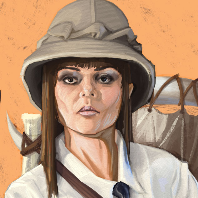
And so that completed the Huntress. Before moving on to the Hunter though, here's a closeup of her face. You may note I switched her originally black hair for brown. No reason for this other than it looked better, if less sinister. It's also possible to see the hatching I've done with the paint better here, especially on the Helmet. For the most part she looks fairly young, but I've pushed the shadows under her eyes a little, and pulled in her cheeks, which in conjunction with the hatched style means she could be older than she might first appear. Hopefully you'll agree she looks less porcine.

As previously mentioned, I already had a pretty good idea of how I wanted the Hunter to look. Since I wanted this obverse side of the card to mirror the first I decided to keep the orange circle in the same location, and the background and colour palette predominantly the same. With the exception of the jacket he's wearing more or less the same as the Huntress. A large cravat type neckpiece, a slightly different style of helmet (both in the original image I did of him for the cover) and more masculine boots, but otherwise the same ensemble.

Since I already had quite a bit of reference from the searches done for the Huntress, along with the image that inspired the stance in the first place (a picture of Michael Caine from Get Carter) I could get on with this one more or less straight away. Unlike the Huntress, and Despite the reference used for inspiration, the images used for reference were far too disparate to use a grid or to trace (though the clothing reference for her was of a similar type), so I sketched it in and then refined it over a few iterations. Like the Huntress I did trace the Shotgun with some minor changes. The hardest part was getting the face recognisably the one from the cover, though from a different angle, and in a different style.
Once I started filling in the large colour areas I pulled in the background from the Huntress so as to have it the same. Obviously I would need to adjust the shadows later, but at this point it was enough to be getting on with.

I realised here that unlike the Huntress, where I had a singular reference I could extrapolate the lighting from, in the case of the Hunter I did not. As a result I used simple blobs of colour to represent the rough location of the lights (more like the direction the lights lay in), the first based on what little lighting I'd already painted up to that point. From there on, like the Huntress, it was mostly a matter of filling in the coloured areas based on the lighting, with the available palette. This time it was a little trickier of course because I kept having to work out roughly where things would be lit from.
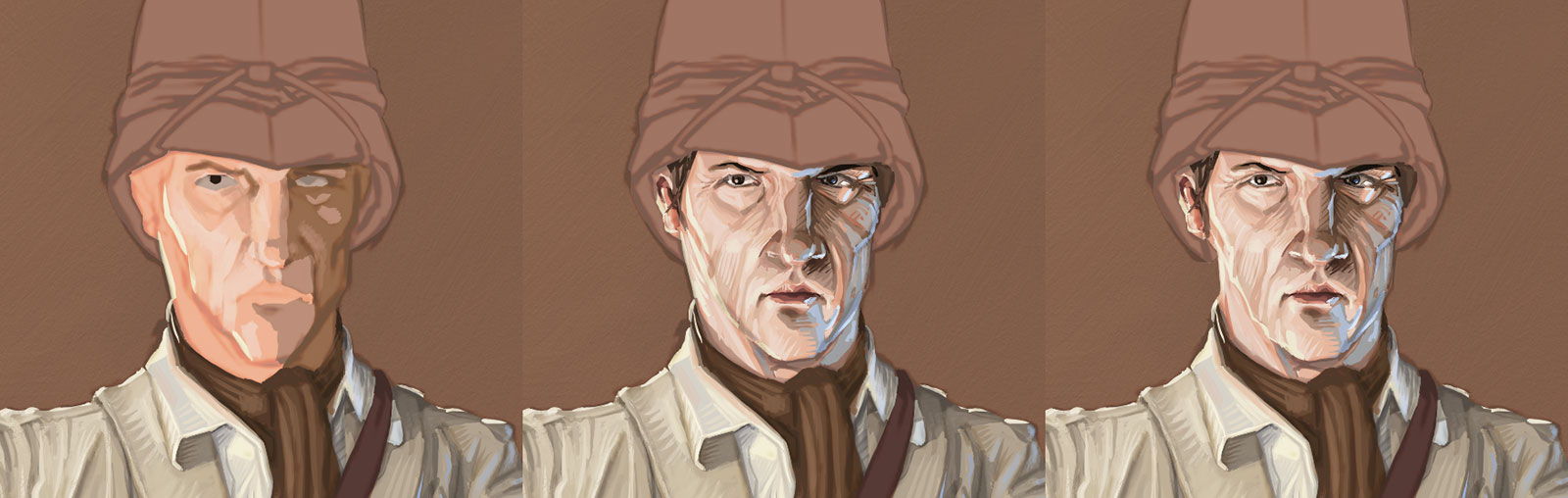
Here's a rough process image of the head. Fairly simple - the flat colour was laid down, and then cleaned up over a few iterations. I cooled the orange of his flesh tones quite a bit from the initial lay-in, though the colours do poke through right to the end. if you're curious as to the difference between the two images to the right, you'll see it's mostly just showing the changes to his neck, which looked quite peculiar being as thick as it was before.

And this takes him to completion too. I did cheat the palette a little to give the shotgun a slight cherry stock, but I thought it wasn't so far removed as to draw the eye particularly. I then added the boots (both the Hunter and Huntress have far rougher boots than anything else, as I found them quite difficult to get right), and pulled in the orange circle from the other image. It needed a little work though, as I hadn't painted behind her when I first did it, so there was a big hole I had to fill in. Hardly a major problem though.
More of an issue was his belt. Like the Huntress I gave him a Sam Brown belt, but when doing the sketch I'd made a mistake - the strap was over the jacket, the belt under it. One could not connect to the other! A bit of editing moved the belt on top of the jacket, as that was easier than repainting the area and removing the distortions of the strap. After repainting the shadow (the background was all on one layer) I signed it (in his right boot, not shown here), and called it quits.

Just for the sake of completeness, here's a closeup of the Hunter's head. You can see that like the huntress I've left the sketch in place, with some editing, to add a little depth to some of the transitions.

Finally, Tyler needed a logo for the front of the box. I'm not going to go into the process there, as it's not particularly interesting, but this is the one arrived at. The intention is to give it a pulp feel, while also keeping it modern and eye catching.
And that's me done. This time I am hopeful for a return next week.
*She really is building a TARDIS - Alas I don't believe it's fully functional.
**What? Don't look at me like that, Kipling seems sort of appropriate given the subject matter.


No comments:
Post a Comment