Before I begin though, I'm going to digress and mention (for my own future reference, as much as your general interest), that in the last week one of our cats has gone missing, and we have a large hole in the house boarded up with plywood from where the new sliding door was supposed to go in, but couldn't because of rot in a support beam. The frustrating thing about the later being that the former could have come home, but would have no way of letting us know because his usual entrance is now covered with boards. Bugger.
Oh, and a stray cat showed up at one point (possibly to relay a message from the missing one, which was useless since we don't speak cat), stayed over night but ran away when it was time to call animal control. One of those weeks.
Anyway, enough about me, and on to the wonder of fake paint!


You may note that there are two versions of this painting above, each a slightly different colour. No I'm not trying to riff on Andy Warhol (but running out of steam after two images), I just can't decide which version I like best. The original is on the top, the second one is colour tweaked in Photoshop. Neither of them is the colour of the original photograph, which was straight black and white. You can enlarge all the images by clicking on them by the way - some of them you may need to.

So, learning from my terrible layout sketch from the last one I decided to A) Forego all that m'larky up front and just start painting and B) use a grid this time. I didn't use a grid for long, just long enough to get the big bold shapes in roughly the right places. I stopped using it somewhere in between the first and second stages above. Even then I put his eye in the wrong place. It didn't take long for me to notice and fix it, but long enough that it irritated me when I did. It's more or less right in the last of these stages here. For this one I saw no reason to change the composition of the Photograph at all - the original photograph was already fantastic, so I left it as was, but just painted it in sepia tones.

Here's me, refining the facial features. There's really not much else to say about this one. Hmmm, OK, so the photo this was based on had a fair amount of damage in places, so I had to infer quite a bit about the left side of his mouth and chin.
This piece, by the way, is of the person's father, who has passed away - as has mine, you may recall. This bit is relevant. So when my Dad died my mother commissioned an artist to paint his portrait to give to my Grandmother. I was never terribly impressed by the painting (though it is vastly better than I could do, especially with real paint), there was something off about the eyes that lost a lot of his character. Anyway, I didn't want the same thing to happen here for someone else, so I put more work into it than I probably otherwise would have.
I have no idea if I succeeded in capturing that character or not, but I did the best I could. Oh, and another coincidence - this person has also hired me before. Two out of four - it's not like I get hired all that much! Very strange coincidence.
Oh, and I cropped it off, because it hadn't changed before the next set of pictures, but I'd blocked in his left hand here too.

Some very minor work continuing on his face, mostly at his hairline and at the base of his nose, but the majority of this sequence is spent on his right hand and shirt. I never did get around to detailing out his little finger, but I don't think it's noticeable in the final piece unless it's pointed out... Which I just did... Way to go me, now you can't unsee it.
Not much to say about the shirt, except that I've shaved off an awful lot of his shoulder since that first block in, giving a bit more definition to the cloth and his neck.
I've also painted in some of the damage that was in the original photograph in the third one here. The small pieces of damage I didn't do, because they weren't helping the piece, but this big swath of light burning in the bottom and the right of the picture I thought looked great, so I added it here.

Here is also where I painted in his hair, and did some general blending before adding the trees. Painting his hair was interesting - I went a little too detailed to begin with, and you can still see the remainder of this as a slightly noisy patch right at the top of his head. Painted over that with a bigger brush though, and ended up getting it to look like his fine buzzcut even though the individual strokes are quite large.
I faired less well with the trees behind him, but I got them to the point where they weren't too distracting. I was tempted to leave the background being much more stark and graphic, but I wanted it to be evident that he's outside, so the trees had to happen.
Finally I took it into Photoshop and played with the colour values for the second version. The bit in Photoshop took all of 10 minutes.

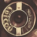
If you're interested, the camera is a Falcon Minette, or a Miniature, or a Minicam Juniour (my money is on the former). Apparently these were made back in the 40's, which feels period accurate to the photo, though I had it pegged for the 50's when painting (which it could be - they made things to last back then). The easiest way to tell is from the label around the lens. Amusingly I didn't think of doing the corrections to see what it actually said until I was finished and working on the thumbnail for the post, at which point I'd painted the logo from a reference that was backwards and rotated and blurred. I'm quite pleased at how close I got to the real thing as a result.
And that, for this tale, is the end.


No comments:
Post a Comment