
Shortly after writing my last entry io9's Esther Inglis-Arkell wrote an interesting post about people, blind from birth, who regain sight later in life and have trouble processing what they see. You can read it here. It's not entirely relevant to the point of these posts, but it is interesting that it would seem the brain processing images into something useful is something likely learned while young, which tallied nicely with my 'Visual shortcuts and Illusions making the understanding of art possible' argument of the last part. Especially relevant was the following passage:
"Another area that many newly-sighted people find inexplicable is paintings and other visual representations. They can comprehend real objects, but not painted ones. When they do understand what the paintings are meant to represent, the shadows that are meant to define space and give shape just look like dark marks on the painting. Which, technically they are."
This isn't especially relevant to the illusions I'll be talking about today, but I thought it was of interest to the general topic regardless. But enough of that, onto today's subject.
So you're there with your easel, or your monitor or what not. Beyond the easel you have your life model or still life, or a photo pinned to the frame, or (in the case of my speedpaints), your reference on a second monitor. Great, your reference is right there! Reproducing it on the canvas should be as simple as making marks in the same locations as the source and calling it a day, right? But getting them in the right place is a lot more difficult than you might think (unless you actually are an artist, in which case you know exactly how difficult it can be). Darn.
Between looking at the subject, and then looking back at the canvas (or monitor, or whatever) you're storing information temporarily in your brain that you then need to parse and turn into hand movements that reproduce what you stored. It's not a long time, usually a fraction of a second, but even that is enough to garble the information a little. This is not related to optical illusions of course, but the problem is compounded by the fact that what you saw and stored in your brain for parsing wasn't accurate to begin with. And even when it is correct, what you put on the canvas won't look accurate when you compare the two at a glance. Does that seem fair to you? Me either. Let's look at some of the reasons why.
The Leaning Tower Illusion
So there you are with the side by side reference and work as mentioned above, and you're drawing the arm of your model. You check out the source to the right, and transfer it to the work on the left and it looks wrong. The arm is clearly at the wrong angle. Try again, and it's still not right. You finally get it looking pretty close and carry on but the nothing seems to match up. The arm can't be at the right angle, but it looks correct! What gives?
The Leaning Tower Illusion, that's what gives. I've known of this illusion for years, and I'm sure most artists have too, but (to my knowledge) it hasn't been formalized until recently. Basically, when looking at the same angle side by side they will not appear to be the same - one side will appear to lean more than the other. This effect seems to become more pronounced the more in perspective the object appears to be, which is not a great help when painting people, buildings, cars and the like where anything might be pointing into the distance. For years I thought I was just hopeless at judging angles by eye, then I became vaguely cognisant that it was due to an optical illusion, but not to the extent that I bothered to experiment to find out if it really was. But then, when researching this post, I discovered this:
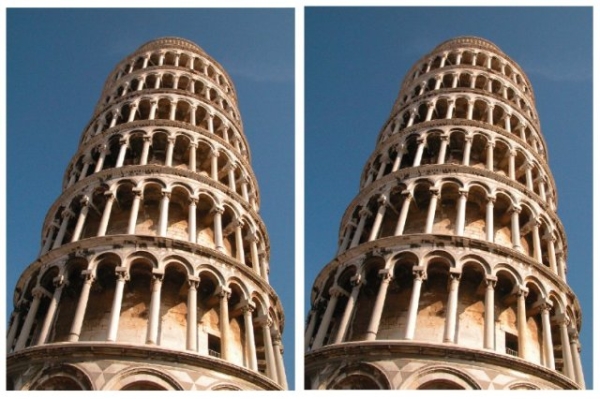
Yes, that's the same photograph twice, and yes it's the leaning tower of Pisa, but you'll probably find the effect works on any form with converging angles (see below). The right image appears to be leaning at an entirely different angle than the left.
You can click the image, or here, to be taken to the Best Illusion of the Year 2007 contest page where this is documented in more detail, though as I've mentioned I think most artists were at least a little aware of it already.
If the image on the left were a painting, and the one on the right a source photograph (or even the real tower) then you can see that the artist would pretty quickly begin to question the accuracy of his work, possibly second guess themselves, overcompensate, and then discover later (maybe when the painting was on the other side of the source) that his painting wasn't accurate at all.
Sad painter!
So why does it happen? I have a vague idea. If I had to guess, based on the fact that it seems to occur to a greater extent the more the apparent lines converge, then I would say it's specifically a quirk of perspective. It's not due to the separation of our eyes as the same thing can occur if the images are one on top of the other, and it barely occurs at all if the lines are perfectly parallel. Look...

In this image we have the same image of an approximate leaning shape twice. They look parallel to one another, because they are.

Here's a similar image, and this time the two identical images seem to be at slightly different angles. There is no actual perspective here, but when the brain sees lines converging it automatically reads it as something receding into the distance, even though it's just two lines.
So my theory is that since the vanishing point (the point where the lines would converge) on these shapes in the second image, and the photograph, is in a different spot, then the brain is convinced that they cannot be parallel, as two parallel objects in perspective would have their lines converge in the same place. If they are not parallel then one object must be leaning more than the other, and thus that's what the brain tells us we're seeing.
Other Common Perspective Illusions
The above isn't the only way that perspective in images can cause problems, another is that the brain tries to compensate for it, a lot. This is most obvious with bold and stark examples, but it does it in even very complex ones. Take a look at the following image (you can click on it to go to the source):
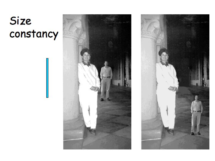
That's quite striking right? Visually the man is obviously smaller in both images, but on the left he appears to be larger than on the right, even though he's the same size in both. The brain has adjusted the apparent size of the figure based on his location on the ground and is compensating for it in each case. It would be difficult to base an accurate sketch just from glancing alone in this situation because not only would the brain make mental adjustments to the source, but also on the work itself, compounding the problem.
A similar illusion can be seen in reality. Place your hands out with the palms facing you at arms length, slightly to either side of your head. They seem to be the same size because they are the same distance away. Bend your elbow to bring one of your hands closer to you, but still keep one to either side of your head so they don't cross. The hand looks larger, because it's closer, but probably only by a little bit. Now cross your hands one in front of the other, and you should see that that difference in size was much larger than you thought.
Your brain, what a complete git.
From elsewhere in the page I got the above example from is this wonderful nugget:
"The visual system compensates for perspective in making judgements about size. It is striking that we are so unaware of this."
Another thing, as well as size, that our brains compensate for is the angle of perspective. I don't mean as in the Leaning Tower example, but rather the brain tries to make things look flatter than they actually are. I've only been able to find a paper on the brain compensating and making sense of photographs and other 2D visual stimuli (such as TV, videogames etc) even when not seen from their optimum viewing angle, which you can read here. But it is my belief that this applies not just to the photographs themselves, but also to the objects within the photograph, as well as other objects in the real world. The brain tries to compensate for things being angled away from us by trying to make them more orthographic (that is, the lines appear slightly more parallel than they should in order to reach the correct vanishing point/point of convergence) . I'll demonstrate this with a speedpaint at some point, but not today, although it has been in evidence on some of my previous speedpaints.
The Eye Level Illusion
Finally, lets look at one of the most significant things the brain likes to do, especially so when trying to match a likeness for a portrait.
It lies about the proportions of the head, and it does it constantly. Weirdly I couldn't find any links referring to this phenomenon as an optical illusion, but it's common place enough that I can't believe it is anything else. How commonplace? Well, almost every online guide and book about portraiture will have a list of common mistakes and how to avoid them in it somewhere. Number one of those mistakes in almost every guide is that the eyes are commonly drawn to high on the head. That's probably the most common mistake made by any artist starting out. Evidence? OK, how's this:

That's not one of mine (though I've made almost the exact same mistakes many times), that's Vincent Van Gogh's. One of his earliest known sketches you can clearly see that the man's eyes have been drawn too far up the head and the ear looks a bit close to the eye (I still do this with alarming regularity).
Why does this happen? Well, my guess is that there's nothing of interest above the eyes, or between the eyes and the ear, so the brain just say "Balls to that then" and edits it out. And it does this when you're looking directly at the source! So I know what you may be thinking at this point - "Okay, smartarse, if that's the case then why don't we go around seeing the world like the Van Gogh sketch above? Clearly we don't, so therefore you're wrong.' But if the brain does this all the time, then it will still do it for an illustration just as much as it does on the source (be it a photograph or an actual person), and since the eyes on the illustration are too high, they appear even higher still. Look, this one I can illustrate with an existing (albeit not very good) speedpaint.
Without taking too long or measuring, is the red line in the following image closer to the top of her hair, or her chin?

If you said closer to the top of her hair then almost everyone agrees with you, even though it's not actually the case. Hell, I'd agree with you, and I painted it and know darn well that red line is right in the middle. Don't believe me? OK, here it is again, feel free to measure this time:

The green and red boxes are exactly the same size. In fact if you compare their sizes at the side of the image, rather than in the middle where her face is it becomes very apparent that they are the same size. If that's not an optical illusion I don't know what is.
And it doesn't just apply to eyes (although that may be where it's most apparent), but to all sorts of things - quite commonly the aforementioned distance from the eyes to the ears, or the ears to the back of the head, or the distance of the chin to the nipple line.
Just to be extra devious though it sometimes does the reverse, and decides that a gap between two things is much less than it actually is because of the extra detail it contains. Take a look at this next image, and note that the black bar on the right appears closer to both the side of the image and the red bar, even though the distances to both are identical for the black bar on the left. The extra detail of the circle pulls those details closer.

The Comparative Colour Illusion
Finally, there's the problem with accurately gauging colours and tones. I'm not even going to write this one up as there are stacks of articles with very good illustrations of common problems in accurately identifying colours and shades in an image or scene. I strongly recommend this one here.
So, WTF?
So with all these things happening to distort our perception of what we are seeing, it is extremely difficult to create a painting or illustration with any kind of accuracy at all. Often accuracy is not actually desired of course, and it is the stylistic deviations from the reality of the source that make many images interesting, but even so if someone's commissioned you to paint their mother-in-law you should probably aim to get a reasonable likeness. Some people do have an innate ability to see past some of these illusions, and still others have taught themselves personal tricks to work around them. I am not one of those people, chances are you aren't either. So how does anyone manage to reproduce anything with a reasonable level of accuracy?
Well, they either get things wildly wrong (which is often the case in my speedpaints you'll note), or to a greater or lesser degree, they turn to mechanical means to help with the problem.
But to discuss that in more detail there will need to be a part three (although despite the title it won't have much to do with illusions...)


My brain hurts, but I'm glad I read this :)
ReplyDelete