 Okay, before you go any further you need to click THIS LINK in order to get some background on this post, because I'm lazy and it saves me typing up a "Previously on Back to the Drawing Board..."
All caught up? Good, then I'll continue.
Philip emailed me at the beginning of August asking if I'd be interested in doing his second volume of TARDIS Eruditorum since his original artist had seemingly vanished. If I said yes I would get to do any other books in the series (on the assumption I don't also vanish presumably), including a reissue of the first volume when they finally release the newly discovered Galaxy Four footage so he can write about it (don't stress if this means nothing to you, but it's a big deal in terms of Doctor Who history).
Well, I said yes didn't I? I mean obviously I did or there would be no post, but really thee was no way I would turn it down. So here we are

There you go, my fist actual book cover - click it to zoom in (though I've only uploaded it at half the res of the final). Pretty snazzy eh? Well, I like it anyway.
The book is based on the blog of the same name (as mentioned in the above link), and is available to purchase in both paperback and digital forms via Amazon. Click the links, buy the book, make Phil rich.
If you read the previously linked post you'll get the jist of why it's in the style of an older and worn book. Phil preferred the idea that the "old" cover was the actual cover rather than being a cover within a cover, and I was just fine with that. I didn't want to just reuse the basic concept of the original cover wholesale though as if I do get to redo volume one then I think it's well suited, so it needed a new look. Or possibly a new old look? Whatever, I knocked up some roughs.

Of these I think the second one was the most true to the concept of volume 1 (and I quite like the sketch I did) while both myself and Phil felt the 4th one had the most late 60's feel to it and we should head in the direction. Unfortunately I used a photo to get that effect, and using a photo was a definite no-no, so I decided to keep the basic layout and head in another direction.
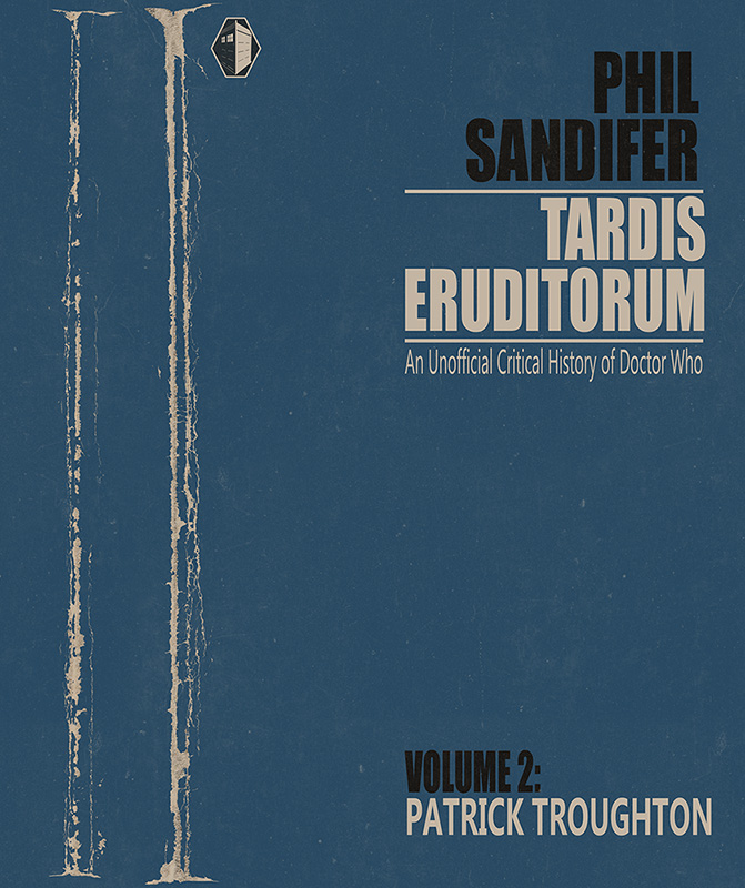
Since I had the layout there I started with that, basing it on the layout for scale sent from Amazon via Philip.
Then I needed something to go in there. We'd been focusing on shapes in the Open Art Group and I'd vaguely wondered if I could do a portrait using just triangles. This seemed like the ideal time to find out.

I didn't work directly from a single photograph, but rather just started laying down triangles and moving them around until it started to resemble Troughton without being so detailed as to get us in hot water over the resemblance. After doing this for a bit I checked how it was looking on the cover and added some elements to the spine.

I decided to change the nose area of his face, and went back to work on the separate image I was building the picture in. You'll note the I've chopped off a good chunk of the bottom of this final image. Mostly that was because even though I'd spent a while laying out all those triangles they really weren't needed for the effect I was looking for (that was all done by hand by the way, not with some clever exploding triangles filter). Maybe I'll get a T-Shirt printed with it on or something...

All the slight tears and damage to the book are hand drawn masks to a paper texture scanned from my sketchbook. I was initially going to just rip them from some old worn books I'd bought as reference, but it turned out that lifting them cleanly from the scans was not as easy as I'd thought, so I did them manually using the scanned reference books as a guide; it took ages but I think it was worth it. I also used those same reference books to decide on a back cover layout. This is nothing like any of them, but the simplicity of it ties in with them thematically. The quote is one I liked from The Doctor that felt suitable to me. The text on the back is the traditional Lorem Ipsum stand-in text while Phil wrote the actual blurb. The dates are wrong for this Doctor, and somehow that slipped by both myself and Phil until I'd submitted the "final" image and a friend of mine on Facebook pointed it out (thanks Ash!). You'll note it's fixed in the final cover - it would have been rather embarrassing if we'd completely missed it. The white "label" on the back is where the barcode will go as in 1968 they didn't have barcodes. I don't think they even had ISBN numbers.

This is the final "fat" cover (still with the wrong dates). This time I've included the bleed area that has to be included in case of incorrect alignment when printing. It's just rough paper texture - so I guess how damaged or clean the edges of the book will appear depend on the alignment during printing. I quite like the idea of it being slightly random. The front cover here is also the Kindle digital edition cover as at the time we didn't know that would need to change.
But it did change. Comparing the full cover up at the top with that last cover you'll notice a few small changes that actually took days of back and forth to do.
Firstly there was the width of the spine. Phil had to guess the pagecount when I started it, and so the width of the spine is based on that guess (actually the pagecount of volume 1). When the final pagecount came in I had to change it accordingly, which was harder than I had initially planned. I'll know how to do it more efficiently next time.
Then Amazon bounced the cover. There were slight wrinkles in the barcode label that should have fallen outside the barcode area but didn't, and the barcode area must be flat white (I guess). Wrinkles removed, back it goes. Bounced again.
This time it was because the word invasions was obscured by the barcode area. Apparently Amazon figured no-one would ever do this intentionally and put in a check for it. You can't say "yes, I know, that's intentional" and get it through, so the text on the back had to be moved so it was higher. Moved, and resent.
And bounced, again. This time it was the front cover at fault (why they don't check all of this at the same time so it can be fixed in one go is anybody's guess). The first volume (and the Kindle edition) had the author as Phil Sandifer, but I guess since the first volume was published they now check the Author name on the cover against the one in their records, which was Philip. so I had to change Phil for Philip so it would go through. Oddly this check isn't performed on the Kindle edition, so that cover was approved ages before (Though it did give Phil some aggravation because some of the book closely resembled text from this website the plagiarism checker had found. Funny that).
So after all that it finally cleared and is now available from the links above with slightly different covers for Kindle and Paperback (Click and buy! Not that I make any money out of it, but making Phil rich means I can ask for more moolah next time ;)).
Phew! None of this would have been a terribly big deal if the file size of the image wasn't close to 30MB and needed to be sent to Phil and then sent by him to Amazon. Ah well, we learned a lot about what not to do next time around.

Finally, here's the cover without all the wear and tear on it. It would probably still make a pretty nice cover, but for me it's the wear and tear that really sells this one as being a book published when Troughton had just recently been the Doctor. Man, I hope it prints OK...


Me: It looks fantastic. Just saying.
ReplyDeleteYou can say that all you want, I won't be complaining. Thanks!
DeleteI would very much like to see a t-shirt of the portrait.
ReplyDeleteSeconded. I'd buy that.
DeleteWell, my contract with Phil doesn't allow me to make money on the art work separately from the cover itself, so I can't go selling T-shirts. That said, if you want to get your own printed, through CafePress or something, then I've made a large print-res version of the artwork available here: http://fav.me/d5gcfkl
DeleteThe background on the image is transparent, so it should print on whatever colour T-Shirt you want. Naturally I'd recommend dark blue :)
That seems a little unfair -- is that intentional or do you think Phil would be open to changing the contract, for future versions at least? Either way, I take it you wouldn't object if I printed up a copy of the t-shirt via CafePress and bunged you an extra $10 via PayPal out of a sense of moral obligation...
DeleteOh, not Phil's fault, I wrote the contract! :)
DeleteI put the clause in so we couldn't rip each other off by selling the artwork on to someone else, pretty standard stuff. This art falls in a grey area though, it's neither the finished piece, nor merely a preparatory piece since it's in the final one, so better if I roll with it (I'd probably upset the BBC as well ;))
No need to send me any money for the artwork if you print it up as a shirt - If I wanted any I wouldn't have put the art up for free :) Just visit the blog occasionally and we'll call it quits. If you really want to you can give the $10 to charity instead. :D
Next time I'll be more specific in my phrasing on the contract.
Yes, fantastic work. I love it. Can't wait to see what you do for the other Doctors.
ReplyDeleteBTW, I agree that Cover 2 of the roughs is excellent too. The blue is very evocative of the Green Dragon edition of The Crusaders (http://www.amazon.co.uk/Doctor-Crusaders-Green-Dragon-Book/dp/041180670X), and the overall design is evocative of the Penguin science fiction of the 60s. What great work.
I'd never seen that cover, but you're right, the resemblance to layout and colour is uncanny. If I had seen it I probably would have pushed for that option more strongly ;)
DeleteIncredible cover!
ReplyDeleteThank you! :)
DeleteArgh! I was considering buying the kindle version as it's cheaper - yes I am that poor - even though I'd prefer the paper edition.
ReplyDeleteI've just come from Phil's blog post on the artwork and I have to say, I love it.
I'm getting the deadtree version!! Really, well done.
Thank you! Sorry for the (very) late response, but it seems that Google shoved you in the spam folder for no apparent reason. I'm very happy you liked the cover enough to get the 'real' thing :)
DeleteJobs a good 'un Jimbo, all those years of working with polygons has really shined for you here. a top notch design job! :)
ReplyDeleteHi James,
ReplyDeleteSuch a fantastic cover and I really look forward to any further volumes you do for Philip and the blog/book.
I was also wondering - do you have an email address I can contact you with to discuss art/covers?
Thanks,
Lewis Christian
I do as it goes, but I don't like to give it out much due to robots and spam and such. That said, it's a gmail account, and it just might start with the username that's right above this post ;)
Delete