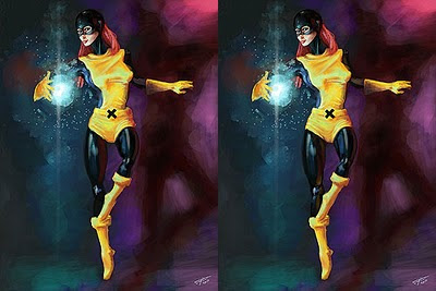
Jean Grey is one of the X-men (usually), and has had several "Hero Nicks" including Phoenix and Marvel Girl. She's pretty rare in comics because she's known more by her own name than by her heroic alter-ego. When I started this for the BLART I did my customary research (Which equates to far to much) and found that the vast majority or Jean Grey images were of the iconic green or red Phoenix/Dark Phoenix outfit. I can see why, it's a very snazzy set of duds if you have a Super Heroine figure, but it meant I wanted to do something different. In the end I chose her original X-men gear from the 1960's.
You can click it and then do some flickr prodding to get an enlarged version if you like.
So, as may become a trend I'll do a blow by blow of the creation process. Most of these images are pretty small, but they hold up well enough if your browser supports zoom and you want a closer look - you'll get a bigger look by clicking on them too..
I started right in on the inks for this one. Originally I sketched it out on paper and then tweaked the result in Artrage. I didn't have to tweak it all that much (Which surprised me), just cleaned up the lines of the costume and repositioned her head and right hand, which were in the wrong place. The result is the line drawing on the left. You may note that the pose is somewhat more dynamic than what I ended up with - somehow over the course of painting she became less dynamic (partly because I didn't have this visible for the majority of the painting). The upper half of the pose was based on a photograph of dancer I found online, but I altered it a bit and added her lower body and legs (The dancer was wearing a skirt and had most of her legs croped in the picture).
The next stage was roughing out the form, lighting and colours in paint (fake paint, obviously). This actually looks pretty good all small like this (It's on the right above), but embiggen it and zoom in to it and you'll get a better idea of just how rough this stage was. You can also see that the blue light is shown as being blue against the yellow of her tunic - This is just because I was working quickly and didn't want to stop and change colours.
Both of these look pretty similar at this size, but look closely and you'll see that on the left the head is unchanged from the previous stage and that her tunic isn't meeting the belt at the right place yet. On the right you can see the head has been painted, and is nothing like the final one. This is because I made a mess of it and had to paint over it. You'll get a better look at the various head stages at the end of the post so you can see just how rank this head really is.
With a note on the tunic - it doesn't look particularly "Superhero Spandex." This is because it's not supposed to; the outfit she's wearing dates from 1963, so I felt a more likely material for her tunic would be some sort of wool blend. When I repainted the cowl/mask I made it more like Neoprene or rubber too (But I kept the rest of the black undergarment shiny, I just liked how it looked).
The image to the left here was actually posted online for a short while. I thought it was done, finished, over, so up it went (I should mention I gave myself a tight deadline of three days on this one, and that was day 3 - I went over by a day after the following). Then I went to work and a colleague said her eye was wonky and there was too much of a gap in her downstairs region. Once he'd pointed it out I couldn't unsee it, so I tweaked it to the version on the right, taking the opportunity to add more definition to her legs and hips while I was about it. I still didn't like her pants area though (looked too saggy), so that got repainted again for the final look. The final pants are not actually correct in the way they crease as best I can judge, but to me they're more aesthetically pleasing, so that'll do nicely.
Now, as with the Nick Fury BLART, I'm going to show a part of the picture at the size I painted it. This time though you can see the progression from the sketch to the finished piece. Notice the third head (left centre), and how I completely repainted it - for the repaint I caught a very rough early version of it. You might want to take a look at her eyes too as that's where the progression occurs in the final two pictures. Click to ensure it's actual size.
Saturday, July 24, 2010
Subscribe to:
Post Comments (Atom)


No comments:
Post a Comment